



children and teenagers take part in city sports programmes. They and their parents have to search other websites or email clubs for missing information.
This adds work for clubs, many of which rely on volunteers.

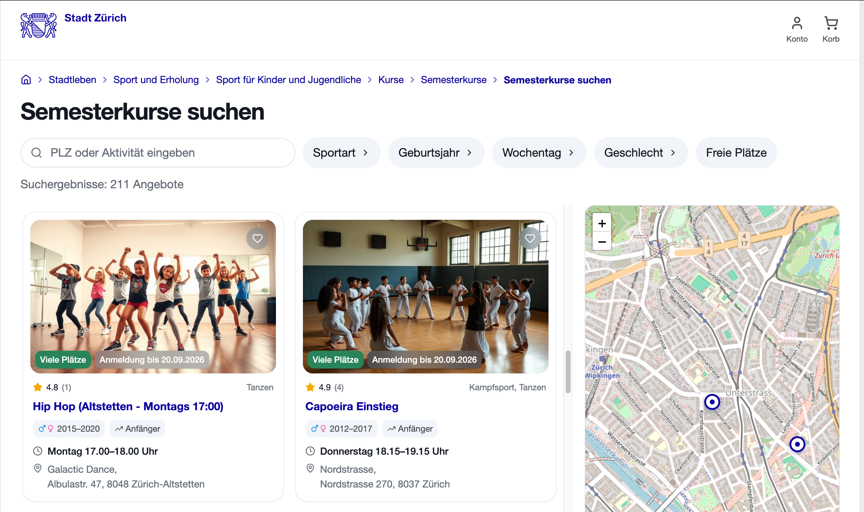
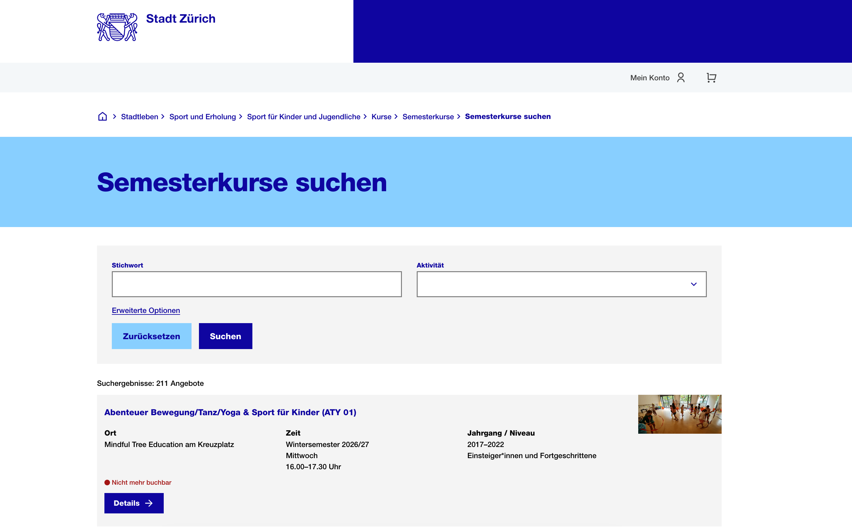
A redesign of Zurich’s sports class search informed by research, product hypotheses and two rounds of usability testing
 2.9× faster
 7/7
 6/6
children and teenagers take part in city sports programmes. They and their parents have to search other websites or email clubs for missing information.
This adds work for clubs, many of which rely on volunteers.

An interface can’t create more places in sports courses.
But it can make choosing easier for parents and reduce manual work for clubs.
RESEARCH
I ran an unmoderated usability test of the existing service and interviewed five parents of school-age children.

Location matters, but the existing map does not help parents compare courses.

Parents have to look elsewhere for trial-session details and email the club.

Addresses, instructor details, ratings and reviews are missing, making it harder to choose.

Multi-select and the gender filter are unclear, and the lists are too long.
BENCHMARKING
I reviewed portals in eight major Swiss cities. None combined clear filters, a useful map, course details and trial-session booking.
SOLUTIONS
I turned four product hypotheses into changes to the core journey:
Parents can compare locations before entering a search or applying filters.
I made all sports visible, marked selected sports with checkmarks, and added a counter.
I organised key details into clear sections and added instructor information and reviews.
I added a request form to the course page to reduce emails between parents and clubs.
I included saving courses as a basic feature, without testing it separately.
UI-KIT & EDGE CASES
VALIDATION
 Maze · Unmoderated test
Participants completed the same search task as in the first test. I tracked task success, search time, use of the built-in map or external sources. Afterwards, participants rated how easy the task was and whether they had enough information.
RESULTS
Five parents tested the existing service and took part in interviews; six tested the redesigned prototype.
I compared median time and ratings for the same search task.
8:13 → 2:52This small study does not establish statistical significance.
I used median time because it is less affected by unusually fast or slow attempts.
Repeat the test with more participants.
After launch, check whether clubs receive fewer emails, this is still a hypothesis, not a measured outcome.
A clearer, more accessible activities portal can help bring Zürich’s smart city ↗ ambitions into everyday life.


